
Perhaps web design or IBM i don’t come to mind when you hear the word “responsive”.
Merriam Webster’s definition of responsive includes “quick to respond or react appropriately or sympathetically” and uses “sensitive” as a synonym.
Dictionary.com tells us “responding especially readily and sympathetically to appeals, efforts, influences, etc.”.
w3schools says it very simply: “Responsive web design makes your web page look good on all devices (desktops, tablets, and phones).”.
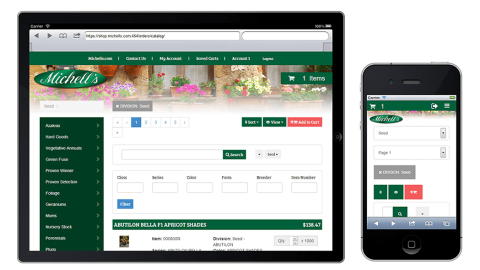
In the IBM i world, responsive refers to web design. A simple explanation for responsive web design? Your single web page design can be viewed on ANY device appropriately (sympathetically).
When you’re designing responsive website or applications, you build ONE single web page. When you open that page on your desktop, it fits to the browser and suits the space. When you open that page on your mobile phone, it fits to the browser and suits the space - both in portrait and landscape mode. This applies to every OS and every browser.
Your web design is responsive to where it is being displayed and the content you display will morph to suit the browser and device. This could mean that some of the content available on a desktop may not be available on a smaller screen. The content might be in different locations, or appear in different shapes/sizes, depending on the device where it is displayed.
Get to Know the Technology
The techniques that you use to create a responsive web page or application are relatively easy. At the core of responsive web design is the responsive grid – a technique that lays out page elements using relative, rather than traditional fixed, units.
The responsive grid includes some helpful CSS language elements. A simple one is the keyword named float, where the element defined by that keyword will float on the page. If you “float” an element to the left, and there are already elements taking up the width of the page, the element will move down, left-aligned and below those already displayed.
Another technique is the @media rule. This provides functionality called “media queries”, where a group of CSS elements can be defined for a specified combination of display elements. You can use media queries to define a layout for a desktop AND define a layout for a tablet AND define a layout for a phone - all in the same CSS stylesheet. You can also use media queries to define the layout for portrait AND landscape mode, for screen AND print mode.
You can place all of the above in the same stylesheet for your web pages or applications. This means that you no longer need multiple stylesheets for multiple devices, and no matter the device, the OS, or the browser, your web design will fit appropriately.
This may seem like a lot of work for the average CSS developer, let alone an RPG or COBOL programmer who has recently graduated from SEU and PDM to developing applications using a modern IDE. There are plenty of online resources and with experience and help from the community, most developers can write their own responsive CSS.
One of the techniques used for web design is CSS frameworks. These are plugins that allow us to add functionality with ease. Most frameworks include HTML, CSS, and JavaScript functionality, and one of the most popular requests is for responsive web design.
There are many open-source responsive frameworks available. Bootstrap (getbootstrap.com) is very popular, and there are many vendors providing bootstrap templates. The options may seem overwhelming, however, consulting with design experts will minimize the task of sorting through the myriad of choices.
Your job becomes one of creating the content, and design is added using variations on the framework. The effort you spend after creating content will be testing that your chosen responsive design works on all of the devices that may be used to access your application/web page.
This is an important point. Programmers tend to believe their screen design is sufficient if it includes the information requested by the customer. For web and mobile applications, we have to step up to a new world - one where we ensure that every access to our application/web page will provide a stellar user experience that invite the user to return and continue to use our application.
Two things matter when getting started with responsive web design on IBM i.
First, designers must be engaged. While the framework is doing more for us, choosing an appropriate template or style should include the opinion of those who are experts.
Second, if we do not test the application on every device we support, then our support will be compromised. With modern desktop browsers, there are debug configurations that may represent mobile devices, and the same applies for the OS X iOS emulator.
While browser tools and emulators provide sufficient representations of the look of your application, you cannot truly appreciate the feel of the application without using it on a specific device. This is just one reason why you should know which devices and operating systems are in use. For an internal application, the testing process is usually reduced. External applications are primarily simpler in nature, and can often be tested on internal devices, with a smaller testing regimen for outside customer reach.
When choosing your tools to develop web pages and applications, consider the support for responsive design. If there is little or no support, you can write your own CSS to provide responsive functionality. If there is support, determine if it is limited to any one framework and ensure that framework suits your requirements. If there is support and there is limited configuration, be sure to determine if you can add plugins or functionality as you need. If a single framework is not chosen, ensure you can turn off those that are unused, to remove confusion and reduce the possibility of overlap and disruption from one framework to another.
With all of these choices, it is always important to ensure your team has HTML, CSS, and JavaScript skills. The future of IBM i applications includes web and today’s developers need to be skilled in - at least - the core language of the web. With mobile being prevalent in the user environment, understanding web opens up the world of mobile. HTML, CSS, and JavaScript are key to our developer’s future.
A final thought - because we work with a modern OS, these techniques are supported and readily available on IBM i. We are becoming familiar with using the IFS folder structure as a key component of our development methodology. This means developers new to IBM i will be working with source and web components quickly, while they are learning the library and object structure which we are so comfortable with.


